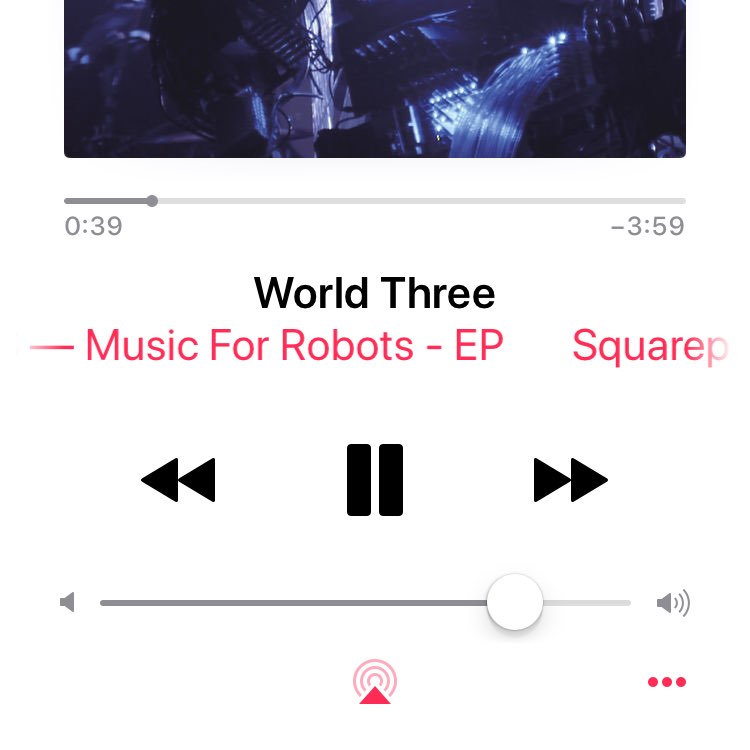
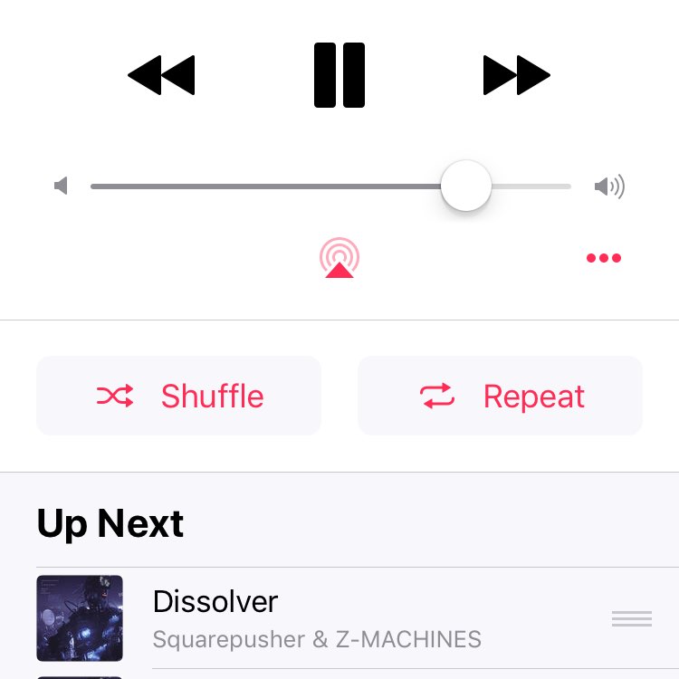
Just spend 10mins looking for the repeat song option in Apple Music on iPad and iPhone, No idea what you call it but the “now playing card” has not clues you can scroll it. Affordance no where to be seen. In fact due to the way it animates in it doesn’t indicate that it is scrollable element, it feels like a card that is showing you everything. Seriously when are we going to move away from these magic hidden gestures. Snap chat I’m looking at you too. I fear iPhone X (still on preorder) will wind me up in this regards… Come on Apple this is not great UX

